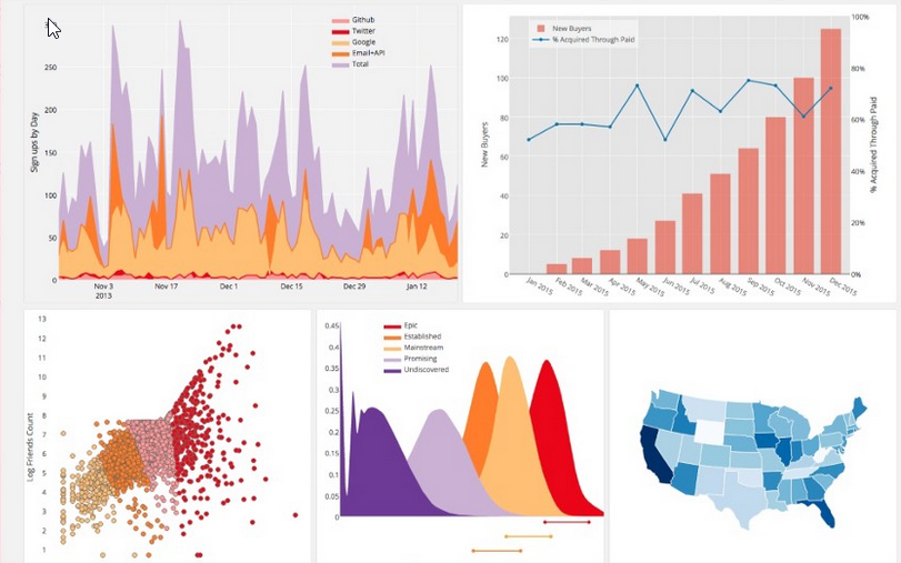
Matplotlib – Python visualizations
**Matplotlib: the foundation of Python data visualization**
When we talk about data visualization in Python, **Matplotlib** is still one of the most widely used and influential libraries in the ecosystem. It has become the backbone for countless other visualization tools, including Seaborn and Pandas plotting.
Matplotlib was originally created by **John D. Hunter (1968–2012)**, a neurobiologist working with electrocorticography (ECoG) data. At the time, his research team relied on proprietary software for visualizing brain signals. However, access was limited—only one license was available, meaning researchers had to take turns using it.
To overcome this bottleneck, Hunter set out to build an alternative inspired by MATLAB. His goal was to create a flexible, Python-based visualization tool that could be used collaboratively by his team and extended by other researchers.
This initiative led to the creation of Matplotlib, which was initially designed for ECoG signal visualization but quickly evolved far beyond its original purpose.
One of its key strengths is its **pyplot interface**, which provides a simple, MATLAB-like scripting environment for quickly generating plots and figures. This made it highly accessible for scientists and engineers who needed fast, reproducible visualizations without complex setup.
Over time, Matplotlib became a core library in the Python data stack, supporting everything from academic research to machine learning, finance, and enterprise analytics.
Today, it remains a fundamental tool for turning raw data into meaningful visual insights—bridging the gap between computation and communication in data science.
#Python #Matplotlib #DataVisualization #DataScience #MachineLearning #Analytics #OpenSource #DataStorytelling
Related Posts

Marketing Intelligence in 2026: turning data into smarter, faster decisions, higher churn

Rclone, Swiss Cloud Knife
